Дизайн паковання для fmcg-брендів
Слідкуємо за тенденціями ринку, керуємо емоційними складовими, робимо продукти та бренди більш релевантними та ефективними
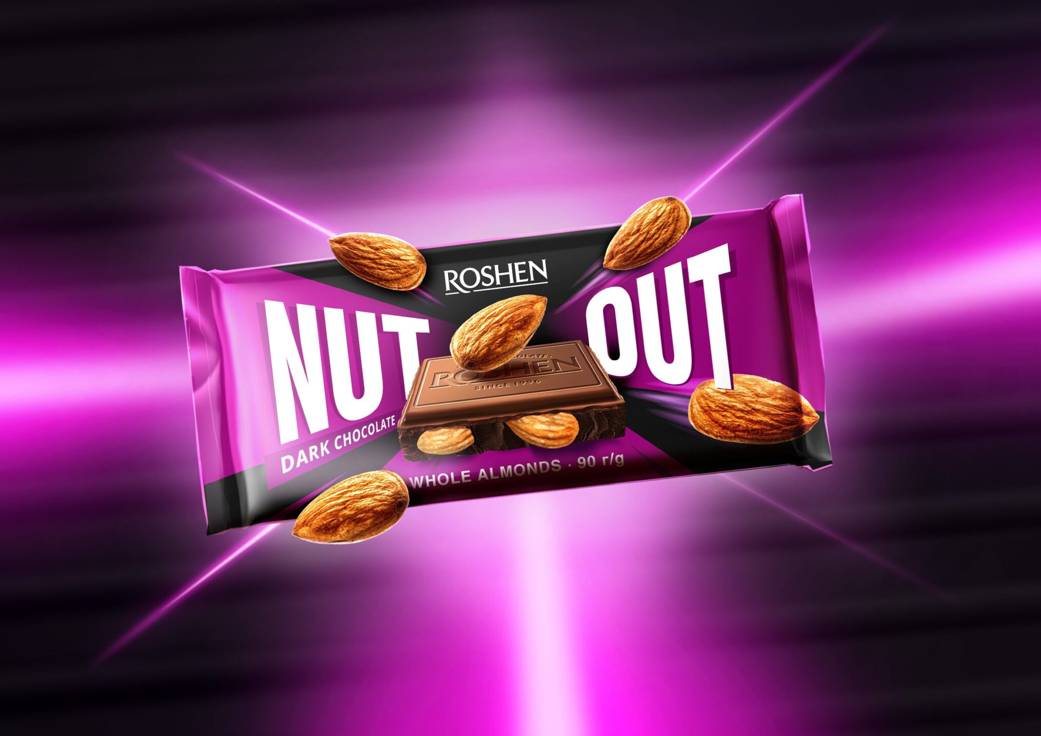
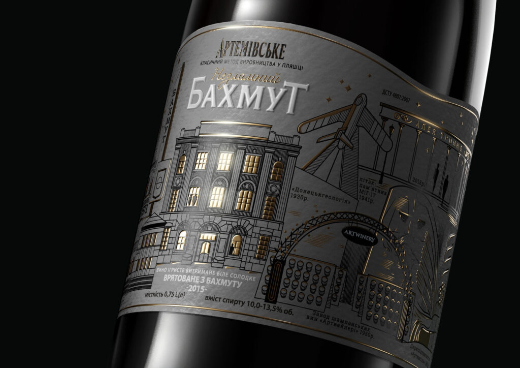
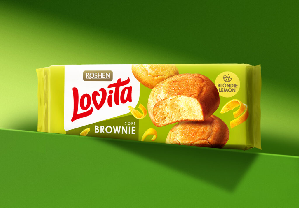
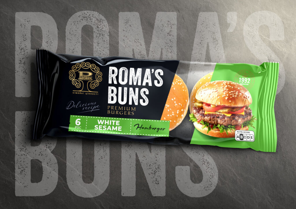
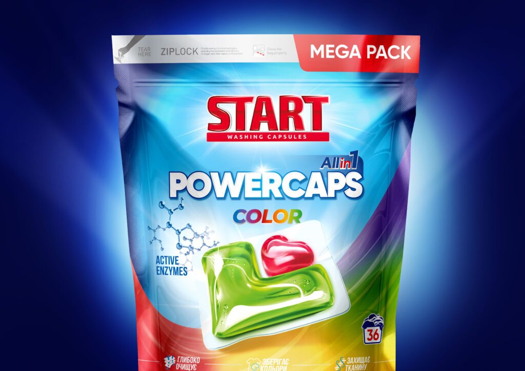
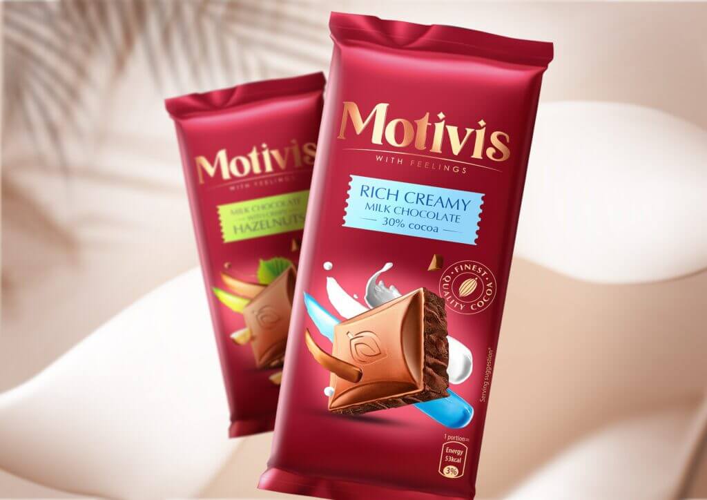
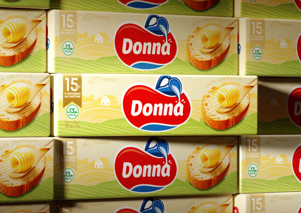
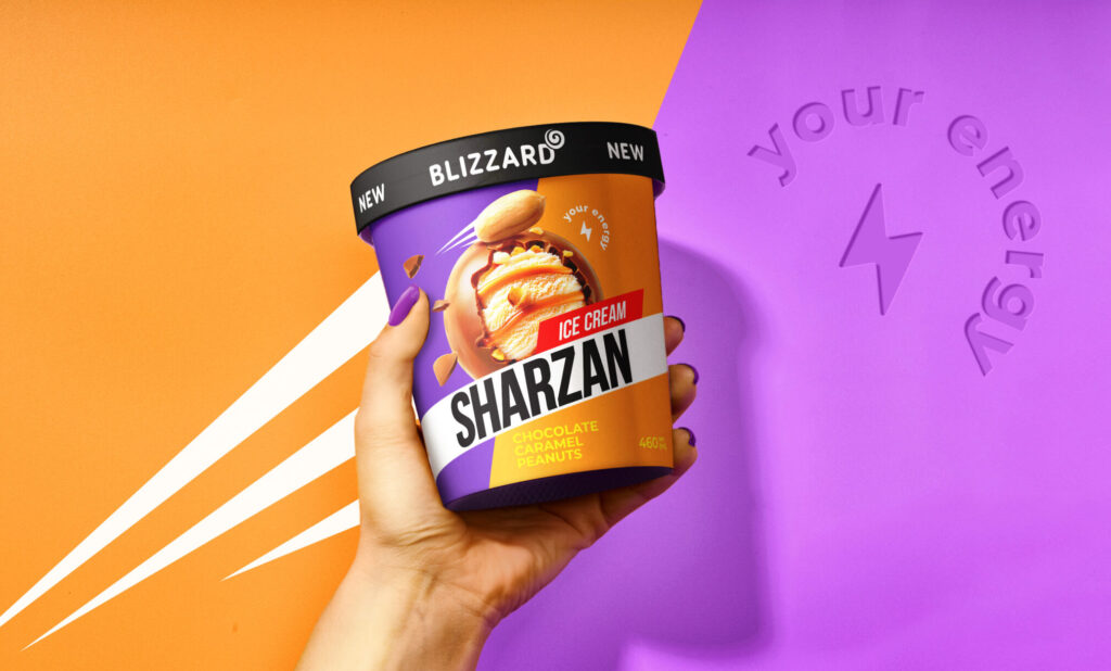
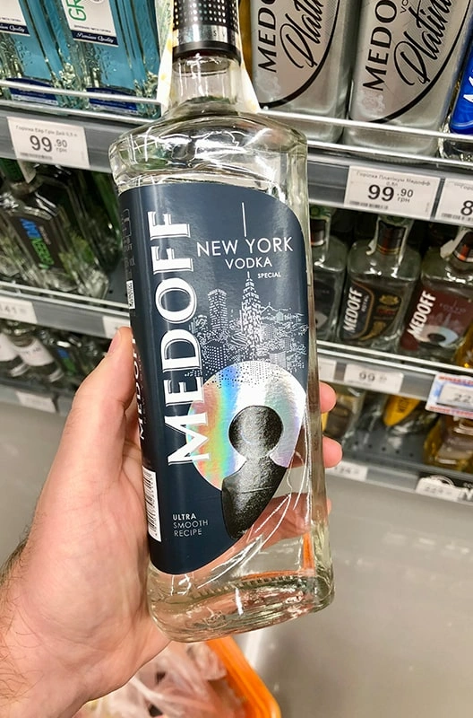
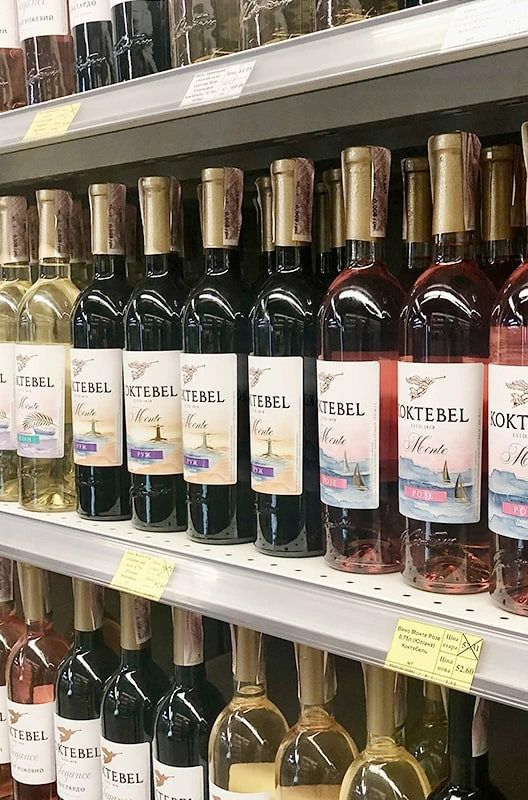
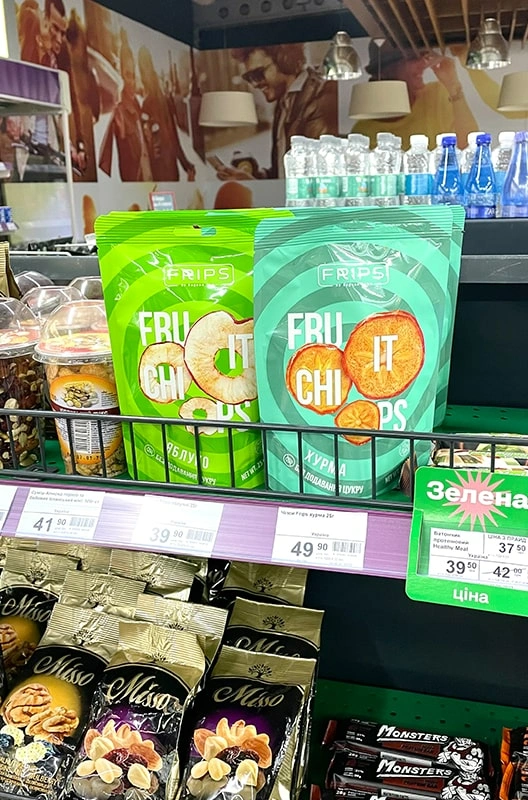
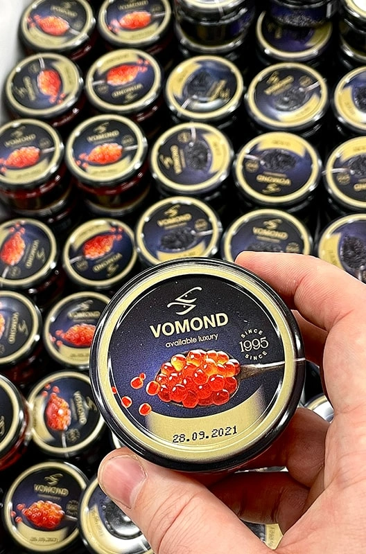
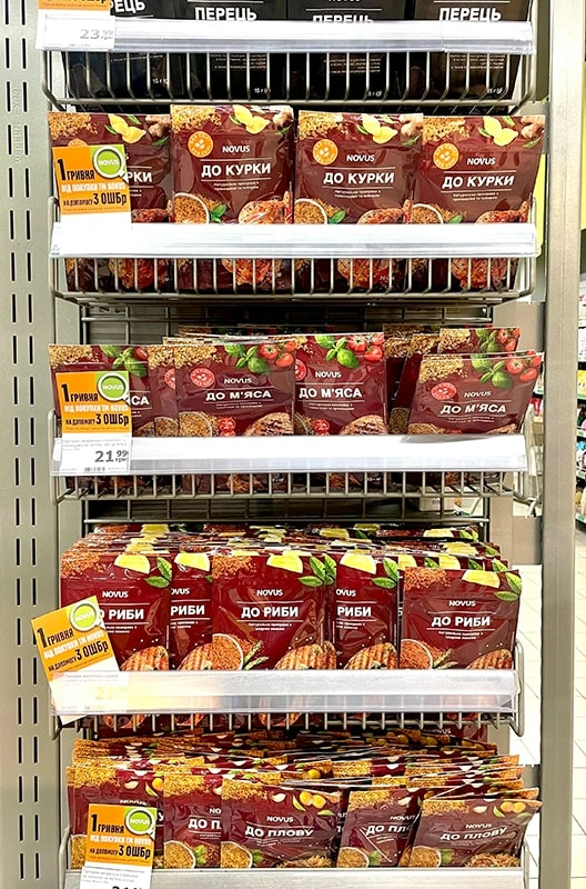
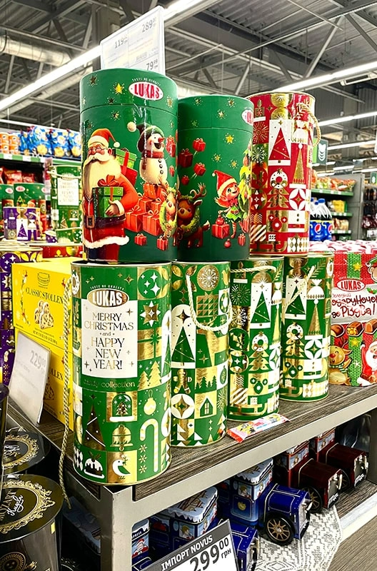
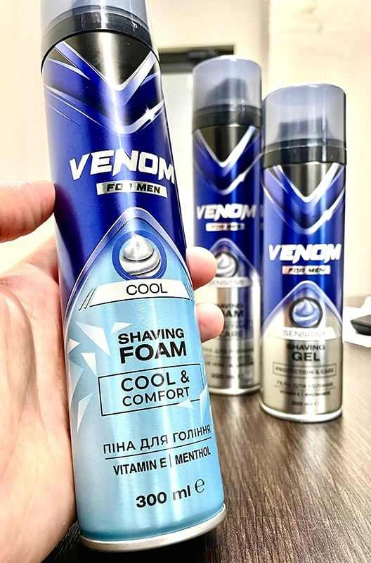
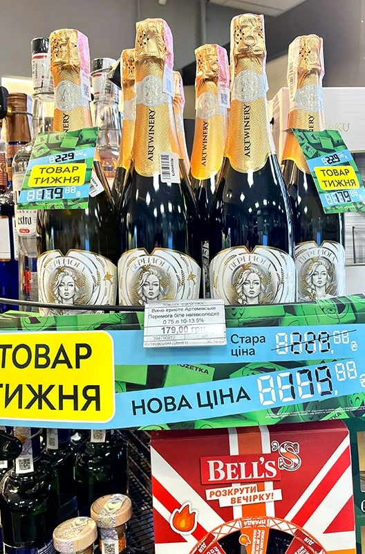
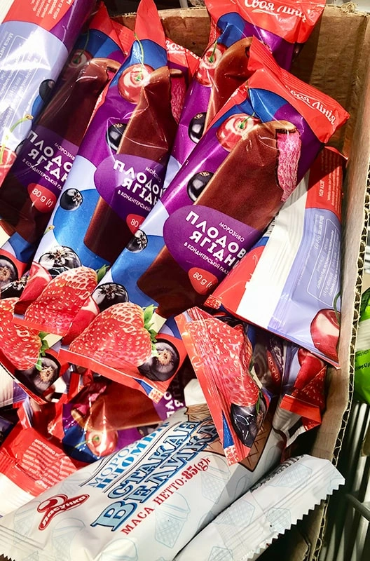
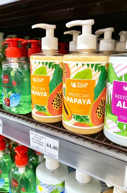
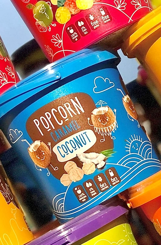
Наші кейси
будуємо комунікацію бренд 
 споживач
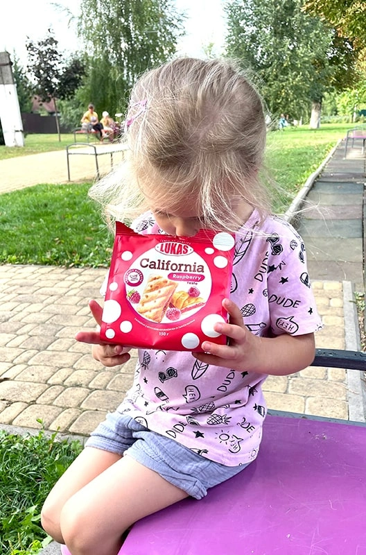
Якщо бренд здобуває любов, то паковання створює перше враження і симпатію!
НАШ ПІДХІД

ФОРМУЄМО ЕМОЦІЮ

ЗБІЛЬШУЄМО КОНВЕРСІЮ
ПАКОВАННЯ ДЛЯ
FMCG-БРЕНДІВ
Орієнтовані на довгострокові відносини
Клієнти агентства POSH — це, перш за все, професіонали, які закохані у свій бренд та зацікавлені в його зростанні й капіталізації. Довіряючи нам свій проєкт, вони отримують не лише якісний дизайн, а й всебічну підтримку на кожному етапі створення й розвитку бренду. Ми з турботою та увагою ставимося до їхніх ідей, як до власного бренду, забезпечуючи сервіс, що відповідає найвищим очікуванням.
інсайти та досвід
співпраця з нами
Ми завжди раді новим корисним і цікавим знайомствам із типографіями та виробниками пакувальної продукції. Це дає нам змогу розвивати себе та наших клієнтів :)
Дизайн упаковки: ключ до успіху на ринку FMCG
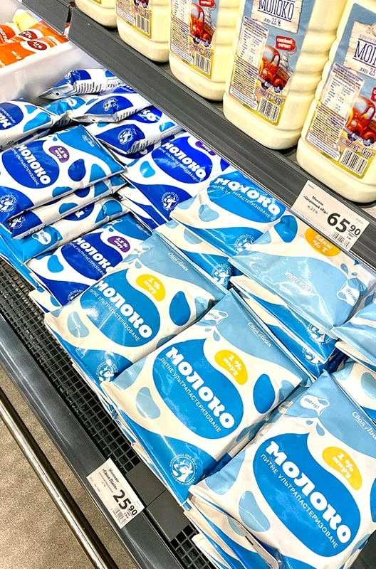
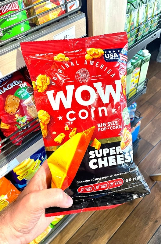
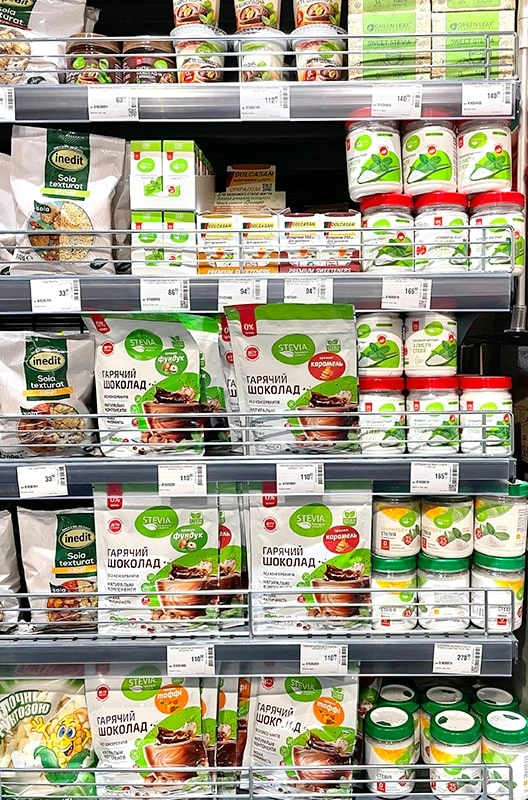
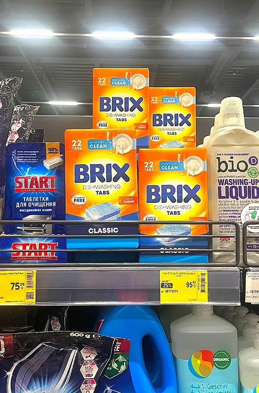
Упаковка – це перше, на що звертає увагу покупець, обираючи товар на полиці. Вона створює враження про бренд, підкреслює рівень якості та виділяє продукт серед конкурентів. Продуманий дизайн упаковки не лише привертає погляд, а й підсвідомо зміцнює впевненість клієнта у цінності продукту.
Сучасні FMCG-бренди прагнуть розробити візуально привабливу, зручну у використанні та відповідну до потреб споживачів упаковку. Яскрава етикетка, оригінальна висічка коробки або стильний фірмовий дизайн допомагають бренду стати лідером на ринку та підвищують ймовірність успіху в продажах.
Створення упаковки для товару: етапи та важливі аспекти
1. Дослідження ринку та аудиторії
Перш ніж розробляти макет упаковки, необхідно дослідити ринок і цільову аудиторію. Виробник має розуміти, які аспекти важливі для його споживачів: екологічність, функціональність чи преміальний стиль. Успішна упаковка орієнтується на вподобання клієнтів, а дизайн підсвідомо викликає довіру.
2. Розроблення концепції та стилю
Після аналізу починається створення упаковки. Тут важливим елементом процесу є дизайнер упаковки, який врахує фірмовий стиль бренду, цінність товару та конкурентні переваги. На цьому етапі формується макет упаковки так, аби він передавав основні характеристики продукту.
3. Виробництво та тестування
Після затвердження макета упаковка проходить тестування на зручність, міцність і зовнішню привабливість. Наприклад, правильно підібрана етикетка підкреслює якість продукту, а форма коробки покращує транспортування та зберігання.
4. Вартість розроблення упаковки
Ціна розробки упаковки залежить від складності дизайну, обраних матеріалів і технологій виробництва. Проте якісна упаковка – завжди інвестиція в успіх бренду. Якщо упаковка допомагає збільшити продажі та покращити сприйняття бренду, її кінцева вартість повністю виправдана.
Чому важливо правильно розробити упаковку товару?
Ефективна упаковка – не просто засіб захисту продукту, а й потужний маркетинговий інструмент. Вона формує перше враження, розповідає історію бренду та підвищує його конкурентоспроможність. Споживач ухвалює рішення протягом кількох секунд, і саме упаковка відіграє вирішальну роль у цьому процесі.
Розробити дизайн упаковки – означає розробити продукт, який виділяється на полиці та викликає бажання купити. Етикетка, візуал коробки, кольорова гама – усі ці елементи працюють на формування позитивного сприйняття товару та зміцнення позицій бренду.
Замовити дизайн упаковки: дизайнер упаковки і вартість розробки дизайна упаковки.
Щоб створити продукт, що відповідає вимогам ринку, важливим є знайти досвідченого професіонала. Дизайнер упаковки врахує особливості товару, проаналізує конкурентів і розробить фірмовий стиль, що підсвідомо впливатиме на рішення клієнта.
Дизайн упаковки на замовлення – це повний цикл послуг: від аналізу до готового макета. Це гарантує, що упаковка відповідатиме сучасним стандартам і сприятиме успіху товару на ринку. Вартість упаковки визначається обраними матеріалами, обсягом роботи та рівнем унікальності дизайну.
Розробка дизайну упаковки – складний і відповідальний процес, що прямо впливає на продажі та осмислення бренду. Якісно продумана упаковка поєднує візуальну привабливість, функціональність і відповідність очікуванням клієнтів.
Незалежно від того, потрібна етикетка, коробка чи повний комплекс послуг зі створення упаковки, професійний підхід допоможе товару зайняти лідируючі позиції та завоювати довіру покупців.