BLIZZARD  Sorbet
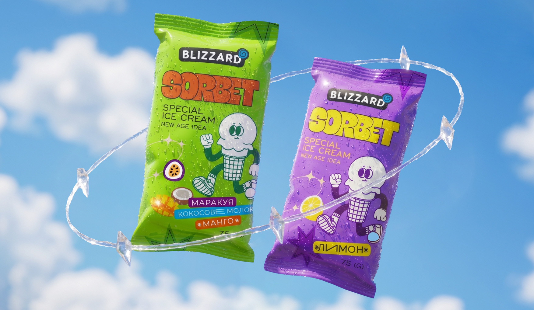
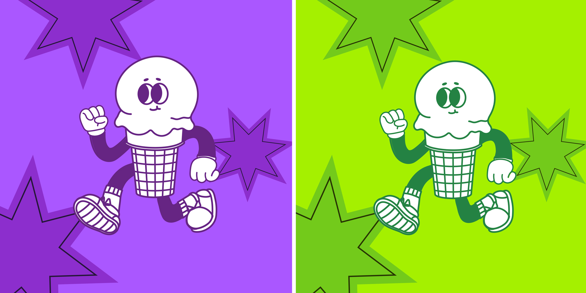
Sorbet does not have to look “natural” and serious. For Blizzard, we shifted the focus from flavour as an image to flavour as a character. This way, the packaging helps people choose and becomes part of the brand’s light, slightly bold way of speaking.
Project Components

Packaging design
Layout design
Preparing for printing
Development of the SKU line
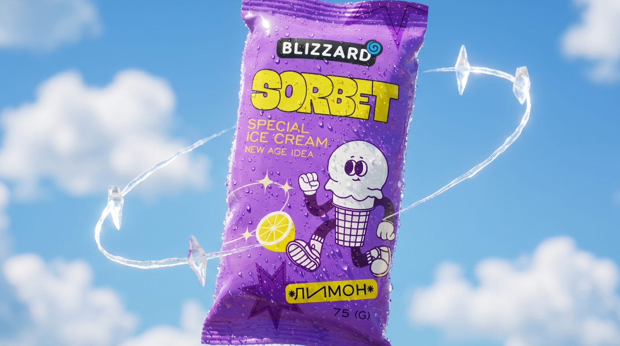
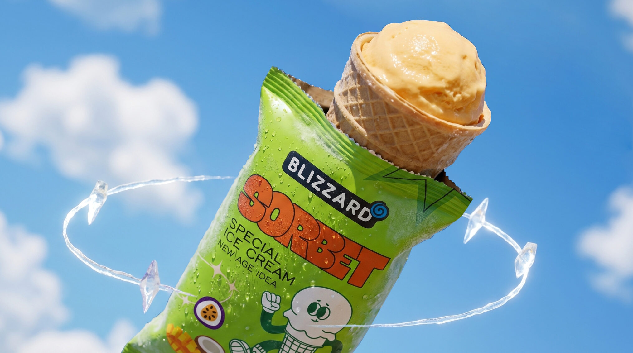
Can sorbet speak to a young audience without the usual berries, splashes, and tempting close-ups? Ice cream packaging often focuses on flavour, so products on the shelf can quickly start to look alike. Packaging design for ice cream Blizzard Sorbet shifts the focus from dessert appeal to character. The product feels like an energetic hero with its own mood and way of speaking. A contrasting flavour system makes the range easy to navigate and keeps a sense of experimentation. Shoppers get a clear choice with emotion, while the brand gets a distinct space to develop the range.