FRIPS  Fruit Chips
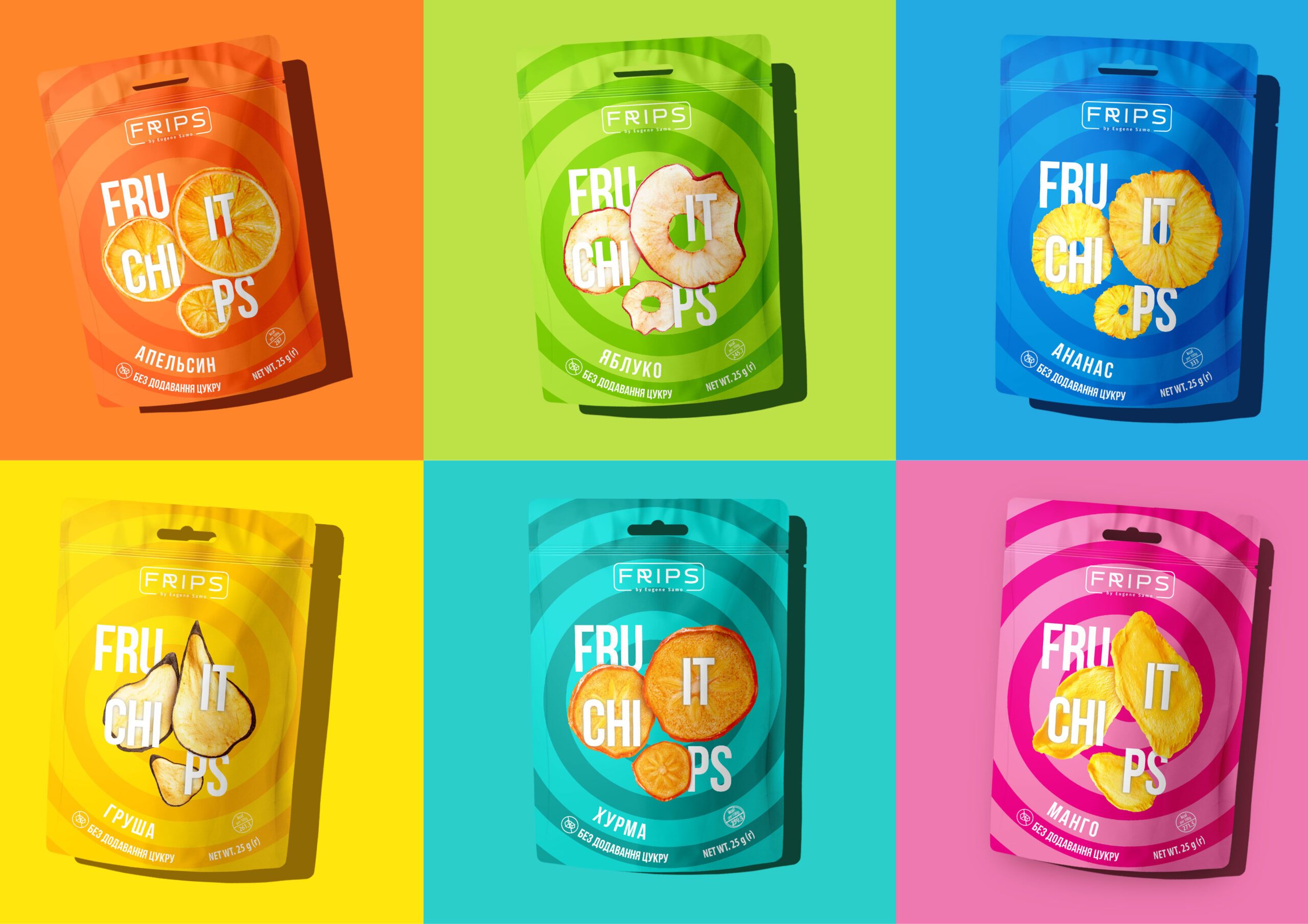
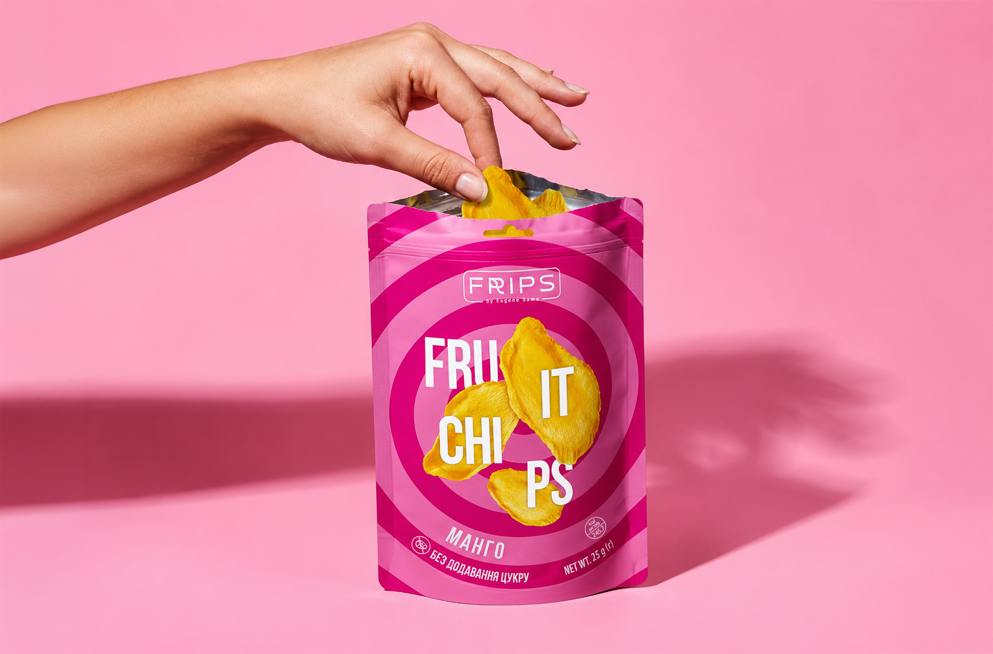
Fruit chips do not have to speak the language of “healthy eating”. For FRIPS, the focus shifts from benefits to the simple desire for a snack. Bright coding attracts attention, flavour cues make choosing easy, and the product feels like a snack rather than a compromise.
Project Components

Packaging design
Layout design
Preparing for printing
Development of the SKU line
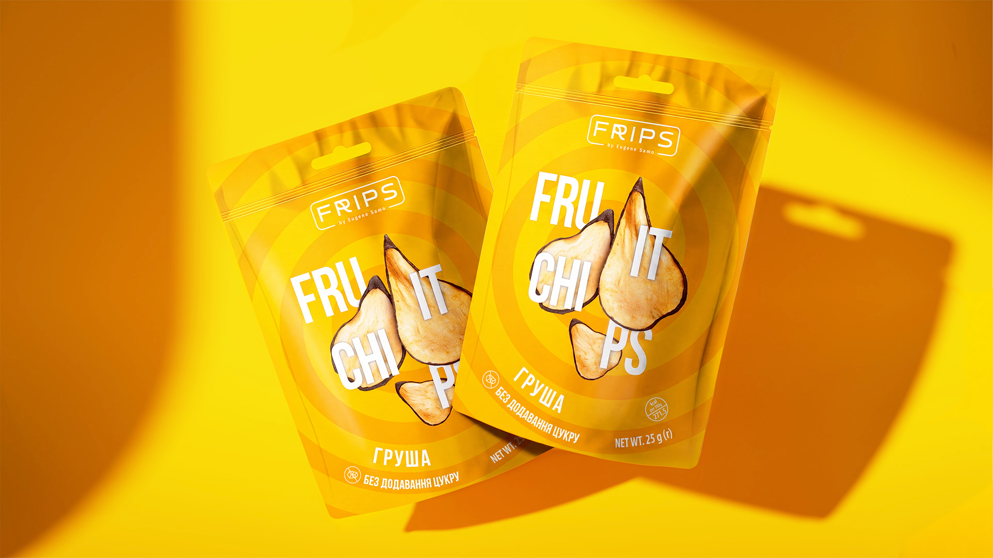
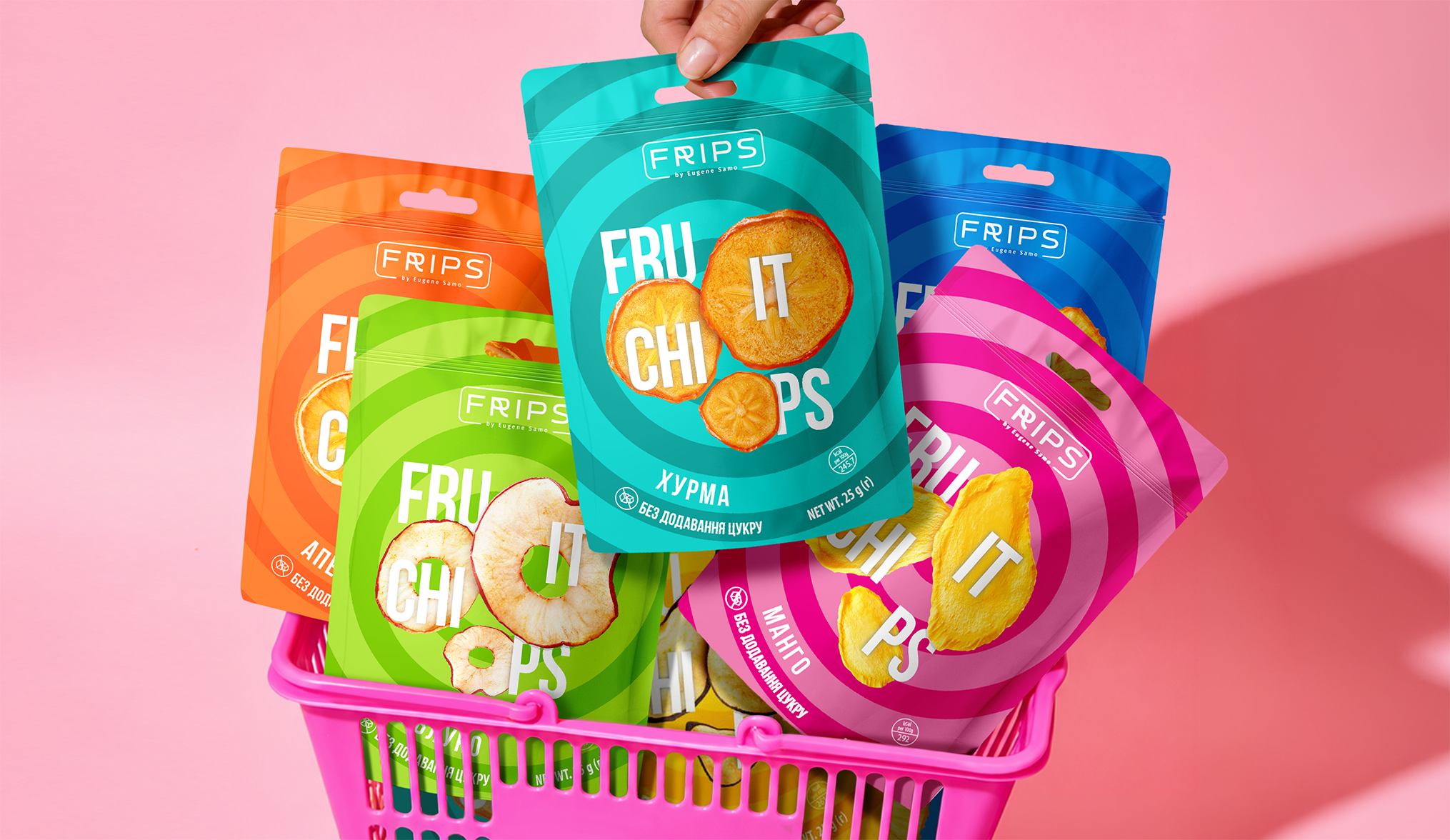
Does a healthy snack have to look restrained? In the fruit chips category, naturalness is often expressed through calm colours and familiar eco cues. But that is not always enough for an impulse purchase. Packaging design for fruit chips FRIPS gives the product a different role: a light, energetic snack that is easy to notice and want to try. A dynamic system attracts attention, while a separate colour for each flavour makes the range easy to navigate. A clear fruit image explains the product without extra words. Shoppers get a simple choice and a real snack feeling; the brand gets a strong system for the whole range.