LUKAS  Fly
Fly
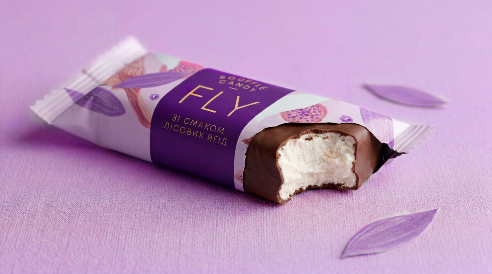
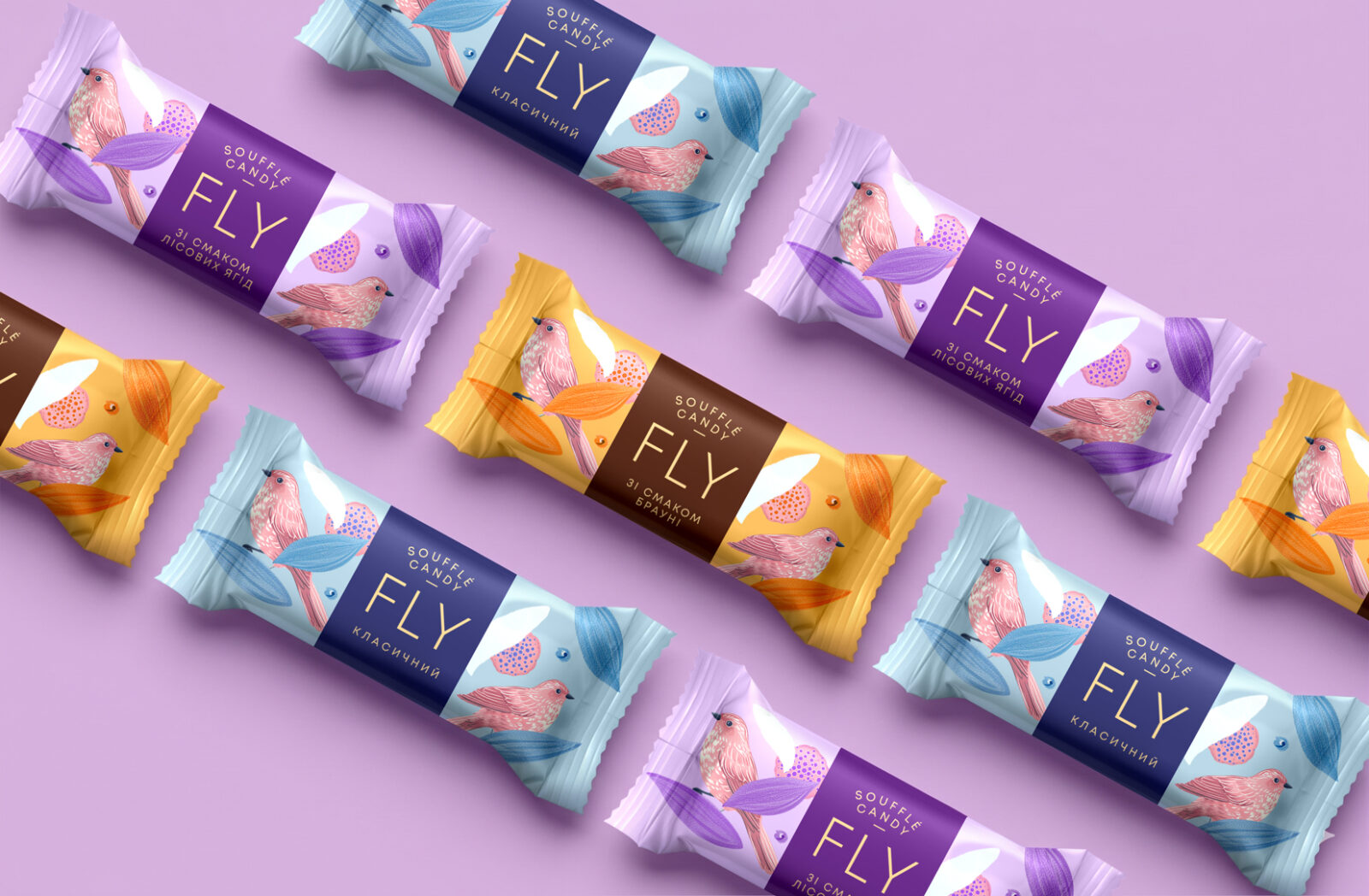
With a name like FLY, the story is not about a heavy taste, but about a light moment. The packaging turns this idea into one language for the whole range: the soufflé gets its own character, while each flavor stays easy to recognize without visual noise.
Project Components

Packaging design
Layout design
Preparing for printing
Development of the SKU line
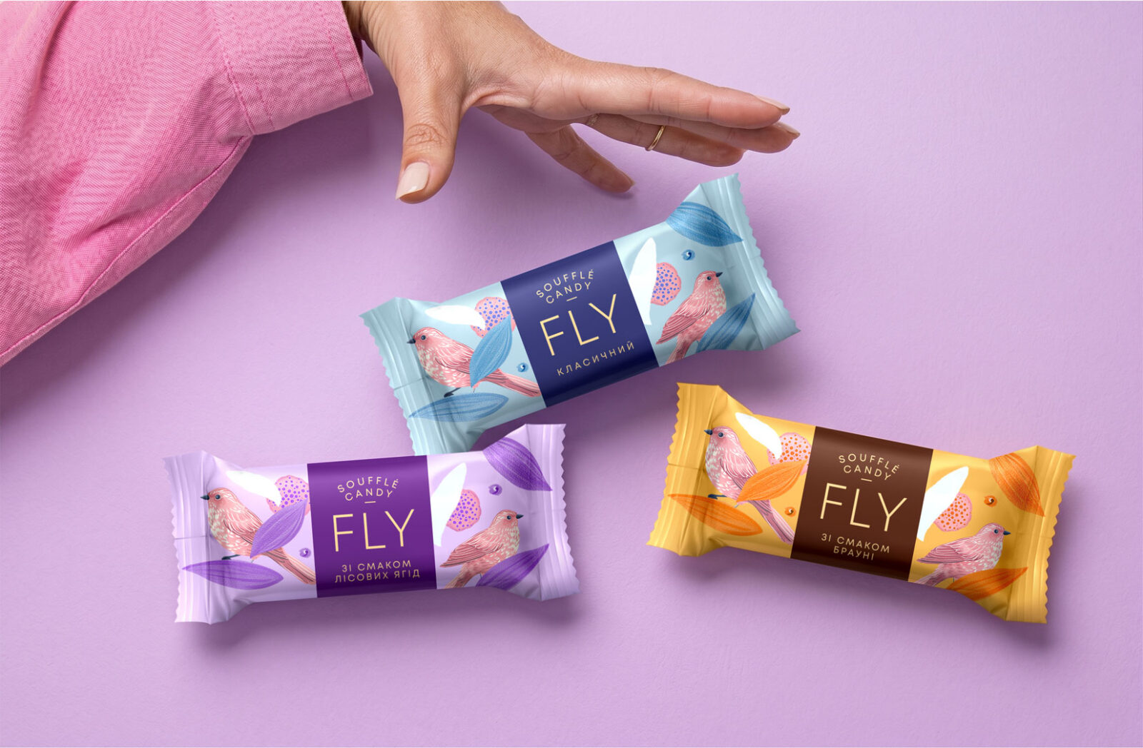
Does a candy always have to speak only about indulgence? In the coated sweets category, brands often compete through appetite appeal, so it can be difficult for a product to build its own emotional identity. Packaging design for FLY candies is based on a feeling of lightness, expressed both in the name and in the nature of the soufflé itself. The idea of flight turns this product quality into a brand character, while color coding makes the flavors easy to navigate without breaking the unity of the range. The shopper gets a clear choice and a light moment of pause, while the brand gets a recognizable territory for future line extensions.